The dark side of data storytelling

Data storytelling is arguably the most important skill an analyst or data scientist can possess. We can consider it the “last mile” of analytics—transforming a jumble of numbers and statistics into a memorable narrative.

This step is crucial because humans crave stories. We learn best from lessons packaged in narratives.

But forming our statistics into a compelling story requires making a series of choices that—in the wrong hands—can twist our results into a misleading conclusion.

To illustrate this potential danger, let me tell you a story.

The path not taken

Doug is a data analyst at Doober, a ride-sharing platform for dogs, and the bigwigs upstairs are noticing that more users than usual are defecting from the app after their first trip. Doug has been tasked with investigating why.

Doug digs into the data. This is his chance to shine in front of the execs! He analyzes anything he can think of that could be related to the root cause of these defections–user demographics, ride length, breed of the dog passengers.

Nothing seems to lead to any conclusions.

Finally, he checks driver tenure and discovers that nearly 90% of defections occur after a ride with a driver who had logged fewer than 5 trips.

“Aha!”, Doug thinks. “Perhaps inexperienced drivers don’t know how to handle these dogs just yet. We should pair new users with more experienced drivers to gain their trust in our platform.”

Satisfied with this insight and already imagining the praise he’ll receive from his manager, Doug starts to put together a presentation. But then, on a whim, he runs the numbers on driver experience across the entire population.

Doug finds that inexperienced drivers account for 85% of first-time trips for new users. This makes sense because Doober is a rather new platform, and most drivers haven’t had time to rack up many trips yet.

Is the difference in the fraction of trips logged by inexperienced drivers statistically significant between the defections and the wider population?

Doug could run a t-test against the trips that didn’t result in a defection to find out…or he could ignore this insight. After all, it doesn’t fit in his narrative, and Doug ­needs a narrative to present to the execs. Data storytelling is important, right?

Is Doug’s insight that most defections occur after a trip with an inexperienced driver wrong? No. But Doug has invited flawed conclusions in favor of telling a slick story.

Cherry-picking

The story of the Doug the analyst is an especially egregious example. Data contortions committed in the name of building a “narrative” are usually more subtle and unconsciously done.

An analyst may simply stop looking once they believe they’ve found an answer and have the data to back it up. After all, time is money.

Now I don’t mean to imply that all analysts are willfully distorting the statistics, like our friend at Doober. But with such a strong emphasis on data storytelling as a core component of the job, junior analysts may start to prioritize narrative over completeness.

Anyone who has read “How to Lie with Statistics” is familiar with the fact that a single dataset can produce diverging storylines, depending on how you slice and parse the data. Telling the story that best represents the data relies on an analyst’s professional integrity and judgment.

How to tell a data story with integrity

In an ideal world, analysts would complete their analysis in a vacuum of rationality before beginning to form a narrative. But that’s never how it really works.

Analysts must form narratives in their mind while analyzing data. Putting results in the context of a narrative allows them to ask the next logical question: if I’ve discovered x, what does that mean for y?

So how can we preserve our analytical integrity while exercising our story-telling creativity? The recommendations below are general best practices for any analysis but especially before committing yourself to a final data narrative.

    1. Ensure your data is sampled appropriately. Could your data collection method have been biased in any way? Do you have enough data points to draw a reasonably confident conclusion? Consider including confidence intervals on any supporting plots or in footnotes.

    2. Carefully consider your data’s distribution. Will your chosen statistical method best describe your data? For example, if you have a long-tailed population, it may be sensational to report a mean (“Average salary at our company is $500,000!”) when a median would better represent the answer to the question you are being asked (“A typical employee at our company makes $75,000 a year”).

    3. Be extremely explicit about correlation vs. causation. This was one of the major blunders Doug made. Just because defections appeared to be correlated with driver inexperience did not mean that driver inexperience caused user defections. Even if Doug presented his findings without any causal language, the execs would infer causation from the context in which he’s presenting.

      Clearly differentiate between causation and correlation. Use bold font, stick it in a big yellow box on your slide, scream it from the rooftops.

    4. Use footnotes for any messy details. All stories require omission. Every author must constrain themselves to the most relevant details while continuing to engage their audience.

      If you have additional facts and figures that support your story but don’t add to the overall narrative, include them as footnotes or within an addendum. Most execs just want the headline but you never know when you might be presenting to a particularly engaged manager who wants to dig into the details.

    5. Don’t be afraid to say “we don’t know”. The pressure to craft a data narrative can be strong, and confessing you don’t have a story seems tantamount to admitting failure.
      But sometimes you just might not have the necessary data. The business might not have been tracking the right metric over time or the data could be so riddled with quality issues as to be unusable.
      Learn from this experience, and implement a plan to start tracking new relevant metrics or fix the cause of the data quality issues. Look for other angles to attack the problem—perhaps by generating new data from a survey sent to defected users. It’s always better to admit uncertainty than to send the business on a wild goose chase.
FAQ: Data Science Bootcamps

For the past two years, I’ve been mentoring aspiring data scientists through Springboard’s Data Science Career Track Prep course. I myself graduated from Springboard’s Career Track program back in 2017, so I know firsthand how intimidating it can be to try and rebrand yourself as a data scientist without a traditional degree.

I’ve noticed my mentees often have the same questions as their peers concerning the data science industry and the bootcamp track they’ve chosen. I’m compiling a list of these FAQ’s for all aspiring data scientists who are considering a bootcamp or just want my take on breaking into this field.

What advice do you have about searching for my first job?

I highly recommend that your first job as a data scientist (or data analyst) is at an organization large enough to already have a data team in place. You’ll need a mentor—either informally attached or formally assigned—in those first few years, and that sexy itty-bitty start-up you found on AngelList isn’t going to provide that to you.

I also advise that you read the job descriptions very closely. The title of “data scientist” can carry some prestige so companies will slap it on roles that aren’t actually responsible for any real data science.

Even if you think the job description outlines the kind of role you’re interested in, ask lots of probing questions in the interview around the day-to-day responsibilities of the job and the structure of the team. You need to understand what you’re agreeing to.

Some suggested questions:

    • What do you expect someone in this role to achieve in the first 30 days? The first 90?

    • What attributes do you think are necessary for someone to be successful in this role?

    • How do you measure this role’s impact on the organization?

    • How large is the team and what is the seniority level of the team members?

    • Is your codebase in R or Python?

Don’t be afraid to really dig deep in these conversations. Companies appreciate candidates who ask thoughtful questions about the role, and demonstrating that you’re a results-oriented go-getter will separate you from the pack.

What’s the work/life balance like for data scientists?

I think I can speak for most data scientists here when I say work/life balance is pretty good. Of course, situations can vary.

But I believe data scientists occupy a sweet spot in the tech industry for two reasons:

    1. We don’t usually own production code. This means that, unlike software engineers, we aren’t on call to fix an issue at 2 am.

    2. Our projects tend to be long-term and more research-oriented so stakeholders typically don’t expect results within a few days. There are definitely exceptions to this but at the very least, working on a tight deadline is not the norm.

That being said, occasionally I do work on the weekends due to a long-running data munging job or model training. But those decisions are entirely my own, and overall I think the data scientist role is pretty cushy.

Besides Python, what skills should I focus on acquiring?

Contrary to what a lot of the internet would have you believe, I really don’t think there’s a standard skillset for data scientists outside of basic programming and statistics.

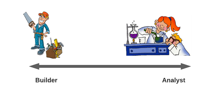
In reality, data scientists exist along a spectrum.

On one end, you’ve got the Builders. These kinds of data scientists have strong coding skills and add value to an organization by creating or standardizing data pipelines, building in-house analytical tools, and/or ensuring reproducibility of projects through good software engineering principles. I associate with this end of the spectrum.

On the other end, we have the Analysts. These data scientists have a firm grasp of advanced statistical methods or other mathematical subjects. They spend most of their time exploring complex feature creation techniques such as signal processing, analyzing the results of A/B experiments, and applying the latest cutting-edge algorithms to a company’s data. They usually have an advanced degree.

It is very rare to find someone to truly excels at both ends of the spectrum. Early on in your career, you might be a generalist without especially strong skills on either end. But as you progress, I’d recommend specializing on one end or the other. This kind of differentiating factor is important to build your personal brand as a data scientist.

Don’t I need a PhD to become a data scientist?

It depends.

If your dream is to devise algorithms that guide self-driving cars, then yes, you’ll need a PhD. On the other hand, if you’re just excited about data in general and impacting organizations through predictive analytics, then an advanced degree is not necessary.

Sure, a quick scroll on LinkedIn will show a lot of data scientist job postings that claim to require at least a master’s degree. But there are still plenty of companies that are open to candidates with only a bachelor’s degree. Just keep searching. Or better yet, mine your network for a referral. This is hands-down the best way to land a job.

Another route is to get your foot in the door through a data analyst position. These roles rarely require an advanced degree but you’ll often work closely with data scientists and gain valuable experience on a data team.

Many companies will also assign smaller data science tasks to analysts as a way to free up data scientists’ time to work on long-term projects. Leverage your time as an analyst to then apply for a data scientist role.

I’m considering applying for a master’s program instead of going through the bootcamp program. What do you suggest?

I’m hesitant about data science master’s programs.

When you commit to a master’s degree, you’re delaying your entry into the job market by two years. The field of data science is changing so rapidly that two years is a long time. The skills hiring managers are looking for and the tools data teams use may have shifted significantly in that time.

My personal opinion is that the best way to optimize your learning curve is to gather as much real-world experience as possible. That means getting a job in the data field ASAP.

Additionally, the democratization of education over the past decade now means that high-quality classes are available online for a tiny fraction of the price traditional universities charge their students. I’m a huge fan of platforms like Coursera and MIT OCW. My suggested courses from these sites can be found here.

At the end of the day, companies are just relying on these fancy degrees as a proxy for your competence to do the job. If you can show that competence in other ways, through job experience or a project portfolio, shelling out tens of thousands of dollars and multiple years of your life is not necessary.

I’m planning on working full-time while enrolled in the bootcamp program. Do you think that’s doable?

Yes.

But it will require discipline and long unbroken stretches of time. You won’t be able to make any meaningful progress if you’re only carving out time to work on the bootcamp from 5-6 pm every weeknight. Your time will be much better spent if you can set aside an entire afternoon (or better yet, an entire weekend) to truly engage with the material.

Committing to the bootcamp requires a re-prioritization of your life. As Henry Ford said, “if you always do what you’ve always done, you’ll always get what you’ve always got.”

What advice do you have about the capstone projects?

Find data first.

I recommend Google’s dataset search engine or AWS’s open data registry. Municipal governments also do a surprisingly good job of uploading and updating data on topics ranging from employee salaries to pothole complaints.

Once you’ve found an interesting dataset, then you can start to formulate a project idea. For example, if you have salary data for municipal employees, you could analyze how those salaries vary by a city’s political affiliation. Are employees in Democratic-controlled areas paid more than Republican-controlled or vis versa? What other correlations could affect this relationship?

Once you understand those interactions, you could train a machine learning model to predict salary based on a variety of input, from years of experience to population density.

It is much harder to start with an idea and then scour the internet trying to find the perfect publicly available dataset. Make your life easier, and find the data first.

Closing

All that being said, the most important piece of advice I can give is to have fun.

You’re making this career change for a reason, and if you’re not enjoying the learning process, then you might be on the wrong path. Becoming a data scientist is not about the money or the prestige—it’s about the delight of solving puzzles, the joy of discovering patterns, the gratification of making a measurable impact. I sincerely hope that you find your career in data as satisfying as I’ve found mine so far.

So buckle up and enjoy the ride!

A guide for data science self-study

My path to becoming a data scientist has been untraditional.

After receiving a B.S. in chemical engineering, I worked as a process engineer for a wide range of industries, designing manufacturing facilities for products as varied as polyurethanes, pesticides, and Grey Poupon mustard.

Tired of long days on my feet starting up production lines and longing for an intellectual challenge, I discovered data science in 2017 and decided to pivot my career.

I participated in Springboard’s part-time online bootcamp and managed to land a job as a junior data scientist shortly thereafter. But my journey to learning data science was really only just beginning.

Besides the bootcamp, all my data science skills are self-taught. Fortunately, today’s era of education democratization has made that kind of path possible. For those that are interested in pursuing their own course of self-study, I’m including my recommended classes/resources below.

Python

MIT OCW’s Introduction to Computer Science and Programming

I enjoy lecture-style classes with corresponding problem sets, and I thought this class catapulted my Python skills farther and faster than a lot of the online interactive courses like DataCamp.

Additionally, this course covers more advanced programming topics like recursion that—at the time—I hadn’t thought were necessary for data scientists. Fast-forward six months when I was asked a question on recursion during the interview for my first data science job! I was so grateful to this course for providing a really solid education in Python and general coding practices.

Algorithms and Data Structures

Coursera’s Data Structures and Algorithms Specialization

I only completed the first two courses (Algorithmic Toolbox and Data Structures) of the specialization but I don’t believe the more advanced topics are necessary for your average data scientist.

I can’t recommend these courses highly enough. I originally had enrolled just hoping to become more conversant with common algorithms like breadth-first search but I found myself using these concepts and ways of thinking at my job.

The professors who designed these online classes have done a fantastic job of incorporating games to improve your intuition about a strategy and designing problem sets that force you to truly understand the material. There’s no fill-in-the-blank here—you’re given a problem and you must code up a solution.

I also recommend starting with the Introduction to Discrete Mathematics for Computer Science specialization, even if you already have a technical background. You’ll want to make sure you have a solid foundation in those concepts before undertaking the DS&A specialization.

Linear Algebra

MIT OCW’s Linear Algebra

I needed a refresher on linear algebra after barely touching a matrix in the ten years since my university days. And MIT’s videotaped lectures from 2010 with associated homework and quizzes was a great way to cover the basics.

The quality of this course is entirely thanks to Professor Gilbert Strang, who is passionate about linear algebra and passionate about teaching (a rare combination). He covers this subject at an approachable level that doesn’t require much complicated math.

I did supplement this course with 3Blue1Brown‘s YouTube series on Linear Algebra. These short videos can really help visualize some of these concepts and build intuition.

Machine Learning

Andrew Ng’s Machine Learning

Taking this course is almost a rite of passage for anyone choosing to learn data science on their own. Professor Andrew Ng manages to convey the mathematics behind the most common machine learning algorithms without intimidating his audience. It’s a wonderful introduction to the ML toolbox.

My one gripe with this course is that I didn’t feel like the homework really added to my understanding of the algorithms. Most of the assignments required me to fill in small pieces of code, which I was able to do without fully comprehending the big picture. I took the course in 2017, however, so it’s possible this aspect of the class has improved.

Deep Learning

fastai’s Practical Deep Learning for Coders

Andrew Ng’s Deep Learning course is just about as popular as the Machine Learning course I recommended above. But after completing his DL class, I only had a vague understanding of how neural networks are constructed without any idea of how to train one myself.

The folks at fastai take the opposite approach. They give you all the tools to build a neural network in the first few lessons and then spend the remaining chapters digging into opening the black box and discussing how to improve the performance. This is a much more natural way of learning and leads to better retention upon course completion.

There are videotaped lectures discussing these concepts but I would recommend just reading the book because the lectures don’t add any new material. The book is actually a series of Jupyter notebooks, allowing you to run and edit the code.

Closing

I will warn that this path is not for everyone. There were many times when I wished I could work through a problem with a classmate or dig deeper into a concept with the professor. Online discussion forums for these kinds of classes are not the same as real-time feedback. Perseverance, self-reliance, and a lot of Googling are all necessary to get the most out of a self-study program.

The variety of skills and knowledge data scientists are supposed to have can be overwhelming to newcomers in this field. But just remember—no one knows it all! Simply embrace your identity as a lifetime learner, and enjoy the journey.

Tackling climate change with data viz

Do you feel overwhelmed by the seemingly impossible task of averting the approaching climate crisis?

I usually do. Modern humans (or at least Americans) are addicted to their F-150’s, filet mignon, and flights abroad. Relying on individual restraint will not solve global warming.

Our best chance is for governments to step in and steer us toward a carbon-free future. But where to start?

This is where an intuitive climate simulator called En-ROADS comes into play. Created by Climate Interactive and MIT Sloan’s Sustainability Initiative, this tool allows a user to effectively create their own policy solution to climate change.

Where are these numbers coming from?

Of course, it’s not that simple. Under the hood, the simulator is running nearly 14,000 equations over 110 years from 1990 to 2100 in just 60 milliseconds. These equations rely on factors such as delay times, progress ratios, price sensitivities, historic growth of energy sources, and energy efficiency potential culled from the literature.

If you’re interested in more of the science and math behind the simulation, the En-ROADS team has documented all their assumptions, parameters, and equations in a reference guide that runs nearly 400 pages long. Climate Interactive’s docs offer a more digestible read that also includes a “Big Message” takeaway for each of the levers.

Let’s start building our climate-friendly world

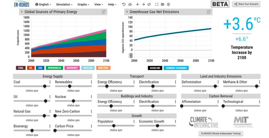
The interface looks like the screenshot below, which shows the starting scenario. This is “business-as-usual”, leading us to an increase of 3.6°C by the year 2100. We see from the colorful plot on the left that the model already predicts a rise in renewable energy by that time—however it looks like the additional renewables go directly to powering a more energy-intensive society as the exojoules expected from other energy sources are roughly constant.

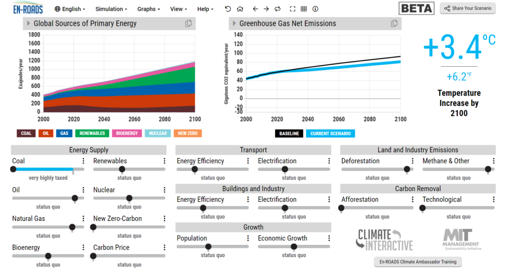
Let’s try to avert this disaster. Coal seems like an easy place to start. We’ll tax it to the max ($110 per ton).

Temperature increase is now at 3.4°C. Not exactly the big boost we were hoping for.

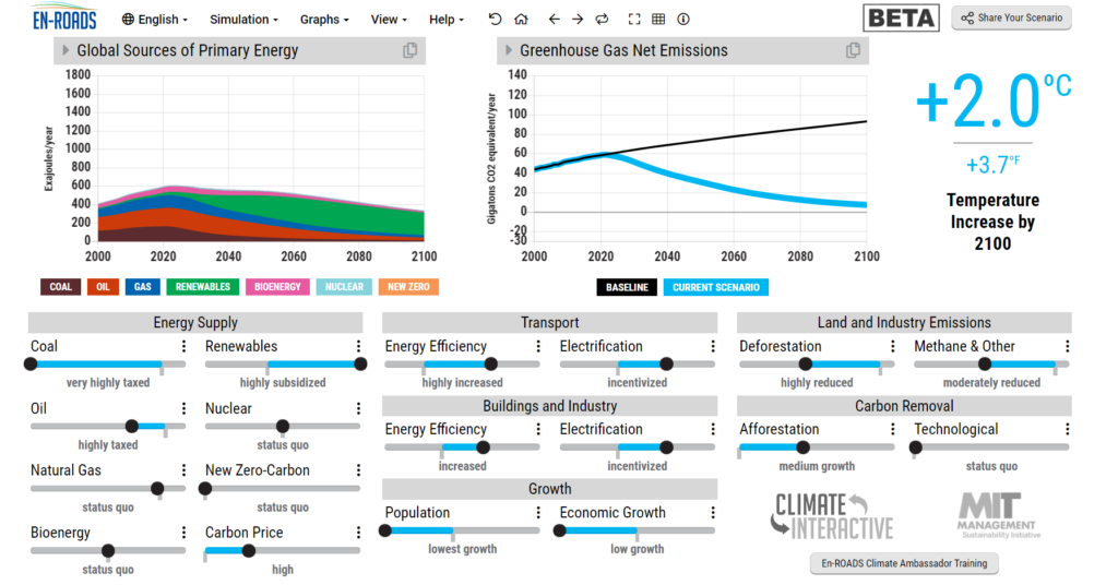
I spent some time playing around with the simulator to limit our warming to 2°C, which is often cited as the threshold before catastrophe. I tried to implement policies that I thought might be politically feasible in the United States. Ones that either retooled existing jobs (electric cars vs. conventional ones) or created new business without disrupting existing ones (increased energy efficiency in buildings).

My main takeaways from the simulation:

Carbon price of $70 per ton → 0.5°C temperature reduction

Implementing a carbon price resulted in the biggest bang for our buck.

The carbon impact of an economy flight from NYC to LA is a half ton of CO2, which I used as a quick benchmark to set a carbon price that didn’t send me into sticker shock. I considered an additional charge of $35 for that flight to be a fee I could swallow, a price En-ROADS labeled “high”.

Note that the simulator also allows you to choose the timeline for this carbon tax to phase in. The default was 10 years to reach the final price, which I did not change.

Population of 9.1 billion in 2100 → 0.1°C temperature reduction

I set population all the way to the left, which corresponds to the lower bound on the 95% probability range from the UN. Considering that not having children is the most environmental choice you can make, I expected a bigger boost from fewer people on the planet.

I suspect the reason behind such a small decrease in warming is that UN model assumes that depressed population growth would come from women’s empowerment campaigns in developing countries, which do not account for the lion’s share of emissions.

Growth of 0.5% GDP/year → 0.1°C temperature reduction

Given the emphasis on moving to a circular economy and away from a growth mindset, I figured limiting our economic growth would result in a sizable reduction in warming.

Wrong.

Granted, the model allows 75 years to achieve this lower GDP growth rate from the current rate of 2.5% GDP growth but a sacrifice of 1% GDP growth in exchange for just 0.1°C in temperature reduction seems like a waste of political capital.

Methane reduction of 75% → 0.3°C temperature reduction

Methane is low-hanging fruit. While the simulator allows us to also limit emissions from certain industries as shown below (agriculture, mining, etc.), I set my reduction as 75% across the board. This would require a more plant-based diet for all, as well as increased accountability within heavy industry to reduce methane emissions.

Other actions taken to limit warming to 2°C included a reduction in deforestation with an increase in afforestation, as well as a modest subsidy for renewable energy. Notably, I did not pull the lever on technological carbon removal, although it’s an easy win to reduce warming. Those technologies have not been proven out, and I don’t believe we can count on them to swoop in and save the day.

My final world is one in which we’ve electrified our homes and transit, phased out coal, aggressively plugged methane emissions, and protected and planted forests. Of course, these initiatives are not simple—electrifying and retrofitting every home in America sounds daunting at best.

But it’s not impossible. From 1968 to 1976, The UK converted every single gas appliance in the country from town gas to natural gas. Just eight years to accomplish what some called “the greatest peacetime operation in the nation’s history”.

Where there’s a will, there’s a way.

Data visualization for social change

But perhaps a more immediate takeaway from the En-ROADS simulation is the experience of using the simulator itself. By distilling the giant thorny problem of climate change into a tangible set of levers, the tool allows stakeholders (humans like us) to grasp the problem and its potential solutions. It offers the ability to drill into a section if we want to understand the technical nitty-gritty but doesn’t overwhelm the user with detail at first glance.

It’s a powerful example of how investing in intuitive data visualization and ceding power to data consumers multiplies the impact of your work.

Of course, the tool isn’t perfect. Specifically, the UI after drilling into a lever doesn’t fill the screen and leads to an awkward user experience. But democratizing access to this kind of scientific literature in a way that a non-technical audience can appreciate is perhaps one of the most important ways to tackle misinformation and overcome apathy.

Tackling climate change is possible. We just need to know where to start.

Classifying Labradors with fastai

Although I’ve been a practicing data scientist for more than three years, deep learning remained an enigma to me. I completed Andrew Ng’s deep learning specialization on Coursera last year but while I came away with a deeper understanding of the mathematical underpinnings of neural networks, I could not for the life of me build one myself.

Enter fastai. With a mission to “make neural nets uncool again”, fastai hands you all the tools to build a deep learning model today. I’ve been working my way through their MOOC, Practical Deep Learning for Coders, one week at a time and reading the corresponding chapters in the book.

I really appreciate how the authors jump right in and ask you to get your hands dirty by building a model using their highly abstracted library (also called fastai). An education in the technical sciences too often starts with the nitty gritty fundamentals and abstruse theories and then works its way up to real-life applications. By this time, of course, most of the students have thrown their hands up in despair and dropped out of the program. The way fastai approaches teaching deep learning is to empower its students right off the bat with the ability to create a working model and then to ask you to look under the hood to understand how it operates and how we might troubleshoot or fine-tune our performance.

A brief introduction to Labradors

To follow along with the course, I decided to create a labrador retriever classifier. I have an American lab named Sydney, and I thought the differences between English and American labs might pose a bit of a challenge to a convolutional neural net since the physical variation between the two types of dog can often be subtle.

Some history

At the beginning of the 20th century, all labs looked similar to American labs. They were working dogs and needed to be agile and athletic. Around the 1940’s, dog shows became popular, and breeders began selecting labrador retrievers based on appearance, eventually resulting in what we call the English lab. English labs in England are actually called “show” or “bench” labs, while American labs over the pond are referred to as working Labradors.

Nowadays, English labs are more commonly kept as pets while American labs are still popular with hunters and outdoorsmen.

Physical differences

English labs tend to be shorter in height and wider in girth. They have shorter snouts and thicker coats. American labs by contrast are taller and thinner with a longer snout.

American labrador
English labrador

These differences may not be stark as both are still Labrador Retrievers and are not bred to a standard.

Gathering data

First we need images of both American and English labs on which to train our model. The fastai course leverages the Bing Image Search API through MS Azure. The code below shows how I downloaded 150 images each of English and American labrador retrievers and stored them in respective directories.

path = Path('/storage/dogs')

subscription_key = "" # key obtained through MS Azure
search_url = "https://api.bing.microsoft.com/v7.0/images/search"
headers = {"Ocp-Apim-Subscription-Key" : subscription_key}

names = ['english', 'american']

if not path.exists():
    path.mkdir()
for o in names:
    dest = (path/o)
    dest.mkdir(exist_ok=True)

    params  = {
        "q": '{} labrador retriever'.format(o),
        "license": "public",
        "imageType": "photo",
        "count":"150"
    }

    response = requests.get(search_url, headers=headers, params=params)
    response.raise_for_status()
    search_results = response.json()

    img_urls = [img['contentUrl'] for img in search_results["value"]]

    download_images(dest, urls=img_urls)

Let’s check if any of these files are corrupt.

fns_updated = get_image_files(path)
failed = verify_images(fns)
failed
(#1) [Path('/storage/dogs/english/00000133.svg')]

We’ll remove that corrupt file from our images.

failed.map(Path.unlink);

First model attempt

I create a function to process the data using a fastai class called DataBlock, which does the following:

    • Defines the independent data as an ImageBlock and the dependent data as a CategoryBlock

    • Retrieves the data using a fastai function get_image_files from a given path

    • Splits the data randomly into a 20% validation set and 80% training set

    • Attaches the directory name (“english”, “american”) as the image labels

    • Crops the images to a uniform 224 pixels by randomly selecting certain 224 pixel areas of each image, ensuring a minimum of 50% of the image is included in the crop. This random cropping repeats for each epoch to capture different pieces of the image.
def process_dog_data(path):
    dogs = DataBlock(
        blocks=(ImageBlock, CategoryBlock), 
        get_items=get_image_files, 
        splitter=RandomSplitter(valid_pct=0.2, seed=44),
        get_y=parent_label,
        item_tfms=RandomResizedCrop(224, min_scale=0.5)
    )

    return dogs.dataloaders()

The item transformation (RandomResizedCrop) is an important design consideration. We want to use as much of the image as possible while ensuring a uniform size for processing. But in the process of naive cropping, we may be omitting pieces of the image that are important for classification (ex. the dog’s snout). Padding the image may help but wastes computation for the model and decreases resolution on the useful parts of the image.

Another approach of resizing the image (instead of cropping) results in distortions, which is especially problematic for our use case as the main differences between English and American labs is in their proportions. Therefore, we settle on the random cropping approach as a compromise. This strategy also acts as a data augmentation technique by providing different “views” of the same dog to the model.

Now we “fine-tune” ResNet-18, which replaces the last layer of the original ResNet-18 with a new random head and uses one epoch to fit this new model on our data. Then we fit this new model for the number of epochs requested (in our case, 4), updating the weights of the later layers faster than the earlier ones.

dls = process_dog_data(path)

learn = cnn_learner(dls, resnet18, metrics=error_rate)
learn.fine_tune(4)
epochtrain_lossvalid_losserror_ratetime
01.3924890.9440250.38983100:15
epochtrain_lossvalid_losserror_ratetime
01.1348940.8185850.30508500:15
11.0096880.8073270.32203400:15
20.8989210.8336400.33898300:15
30.7818760.8546030.37288100:15

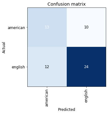
These numbers are not exactly ideal. While training and validation loss mainly decrease, our error rate is actually increasing.

interp = ClassificationInterpretation.from_learner(learn)
interp.plot_confusion_matrix(figsize=(5,5))

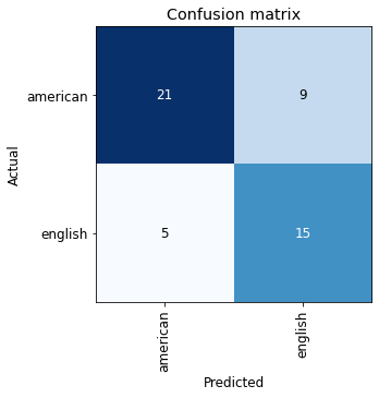
The confusion matrix shows poor performance, especially on American labs. We can take a closer look at our data using fastai’s ImageClassifierCleaner tool, which displays the images with the highest loss for both training and validation sets. We can then decide whether to delete these images or move them between classes.

cleaner = ImageClassifierCleaner(learn)
cleaner

English

We definitely have a data quality problem here as we can see that the fifth photo from the left is a German shepherd and the fourth photo (and possibly the second) is a golden retriever.

We can tag these kinds of images for removal and retrain our model.

After data cleaning

Now I’ve gone through and removed 49 images from the original 300 that were not the correct classifications of American or English labs. Let’s see how this culling has affected performance.

dls = process_dog_data()

learn = cnn_learner(dls, resnet18, metrics=error_rate)
learn.fine_tune(4)
epochtrain_lossvalid_losserror_ratetime
01.2550600.7269680.38000000:14
epochtrain_lossvalid_losserror_ratetime
00.8264570.6705930.38000000:14
10.7973780.7447570.32000000:15
20.7239760.8096310.26000000:15
30.6600380.8496960.28000000:13

Already we see improvement in that our error rate is finally decreasing for each epoch, although our validation loss increases.

interp = ClassificationInterpretation.from_learner(learn)
interp.plot_confusion_matrix(figsize=(5,5))

This confusion matrix shows much better classification for both American and English labs.

Now let’s see how this model performs on a photo of my own dog.

Using the Model for Inference

I’ll upload a photo of my dog Sydney.

btn_upload = widgets.FileUpload()
btn_upload
English
img = PILImage.create(btn_upload.data[-1])
out_pl = widgets.Output()
out_pl.clear_output()
with out_pl: display(img.rotate(270).to_thumb(128,128))
out_pl

English

This picture shows her elongated snout and sleeker body, trademarks of an American lab.

pred,pred_idx,probs = learn.predict(img)
lbl_pred = widgets.Label()
lbl_pred.value = f'Prediction: {pred}; Probability: {probs[pred_idx]:.04f}'
lbl_pred
Label(value='Prediction: american; Probability: 0.9284')

The model got it right!

Take-aways

Data quality

If I were serious about improving this model, I’d manually look through all these images to confirm that they contain either English or American labs. Based on the images shown by the cleaner tool, the Bing Image Search API does not return many relevant results and needs to be supervised closely.

Data quantity

I was definitely surprised to achieve such decent performance on so few images. I had always been under the impression that neural networks required a lot of data to avoid overfitting. Granted, this may still be the case here based on the growing validation loss but I’m looking forward to learning more about this aspect later in the course.

fastai library

While I appreciate that the fastai library is easy-to-use and ideal for deep learning beginners, I found some of the functionality too abstracted at times and difficult to modify or troubleshoot. I suspect that subsequent chapters will help me become more familiar with the library and feel more comfortable making adjustments but for someone used to working more with the nuts and bolts within Python, this kind of development felt like a loss of control.

Model explainability

I’m extremely interested to understand how the model arrives at its classifications. Is the model picking up on the same attributes that humans use to classify these dogs (i.e. snouts, body shapes)? While I’m familiar with the SHAP library and its ability to highlight CNN feature importances within images, Chapter 18 of the book introduces “class activation maps” or CAM’s to accomplish the same goal. I’ll revisit this model once I’ve made further progress in the course to apply some of these explanability techniques to our Labrador classifier and understand what makes it tick.