
Precision and recall aren’t the only ways to quantify our performance when developing a classifier.
Plotting a Receiver Operating Characteristic (ROC) curve is another useful tool to help us quickly determine how well the classifier performs and visualize any trade-offs we might be making as we attempt to balance Type I and Type II error rates.
The basics
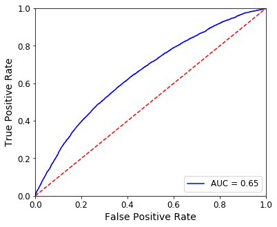
Let’s jump right in. Here’s an ROC curve for a model that predicts credit card default (where a positive is considered to be a default).
Axes
The x-axis represents the False Positive Rate (FPR) or the probability of a false alarm. This can be calculated through:

Put another way, FPR represents the fraction of incorrectly classified negatives (in this case, accounts that did not default but for which our model predicted would default) within the total population of negatives (all accounts that did not default).
The y-axis shows the True Positive Rate (TPR), which is equivalent to the recall.
Recall is just class-specific accuracy or:

Again, in the context of our example, this is the fraction of accounts that did default and for which our model predicted they would within the total population of accounts that did default.
The diagonal
The red dashed line dividing the plot represents random performance. When the FPR matches the TPR, we might as well be guessing–you’re right as often as you’re wrong.
If your curve falls to the left of the diagonal, the model is performing better than random because your true positive rate exceeds your false positive rate. Likewise, a curve to the right of the diagonal indicates some systemic error in your model, causing it to perform worse than random.
The curve
Now that we’ve established the space in which we’re working, we can best understand how to determine the ROC curve above.
The ROC visualizes the trade-offs between the FPR and the TPR when we adjust the threshold by which the classifier makes its determination.
For example, our model could determine a credit default using a probability threshold of 0.25. If the model’s probability of default is 0.32, we would return “default”. If the probability is 0.19, we could return “no default”.
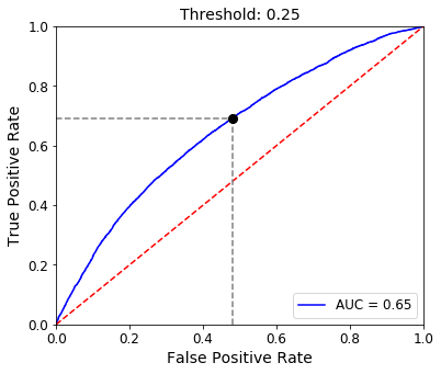
This is illustrated in the ROC plot above. The FPR and TPR for a threshold of 0.25 is represented by the black dot on the ROC curve. Our TPR is roughly 0.7 and our FPR is around 0.45.
Now, let’s lower the threshold to 0.15.
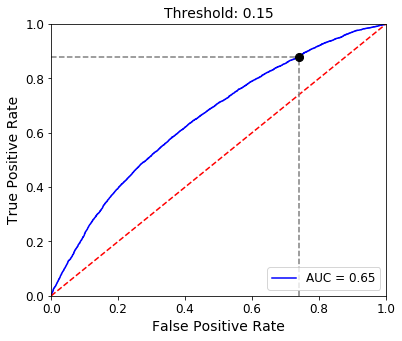
We move further up the curve, increasing our TPR to nearly 0.9 but also increasing our FPR to about 0.75.
This illustrates the principle that as we decrease our decision threshold, we move to the right and upwards along the curve because we are simply classifying more observations overall as positives. Therefore, TPR increases as we capture more of those true positives but at the same time, our probability of false alarm also goes up as we become less strict with our requirement to classify a positive.
Choosing a threshold
This observation begs the question–what would be the optimal threshold to choose?
Of course, this will likely depend on model-specific considerations. For example, what is the cost of a false positive? If it’s relatively low, we might as well increase our TPR at the expense of an increased FPR as well.
However, if we’d like to try and balance these two competing metrics, we can choose the point along the curve that is closest to the top-left corner of the plot. This could be considered the apex of the curve, as shown below.
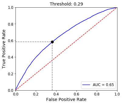
The apex can be found by determining where on the curve we find a maximum difference between TPR and FPR. In our case, this occurs at a threshold of 0.29 to return a TPR of nearly 0.6 and a FPR of about 0.36.
AUC
Perhaps the most widely used application of an ROC curve is to calculate the area underneath it. This is called AUC or “Area Under Curve”.
The area in gray below represents the AUC.
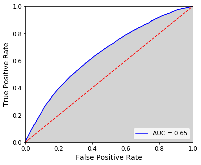
Our AUC for this model is 0.65. A random model would produce an AUC of 0.5 so we are doing better than guessing!
An ideal model would have an ROC curve that hugs the axes with an apex close to the upper-left corner, resulting in an AUC of nearly 1.0. Therefore, AUC is a way to quantify the ability of the model to maximize TPR while minimizing FPR, no matter the threshold chosen.