I’ve been working my way through Practical Deep Learning for Coders, a fantastic resource from the authors of fastai. But while I enjoy the deliberate way the authors are slowly peeling back the layers to uncover what makes a neural network tick, I wanted to just rip the lid off.
So I built a classifier using the techniques provided by fastai but applied the explainability features of SHAP to understand how the deep learning model arrives at its decision.
I’ll walk you through the steps I took to create a neural network that can classify architectural styles and show you how to apply SHAP to your own fastai model. You’ll learn how to train and explain a highly accurate neural net with just a few lines of code!
Gather the data
I followed this great guide on image scraping from Google to gather images for my training set.
Due to the limited availability of images, I settled on seven architectural styles:
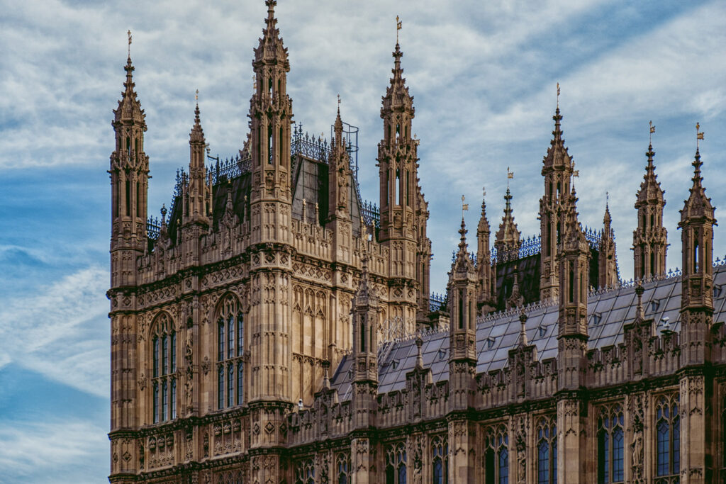
Gothic
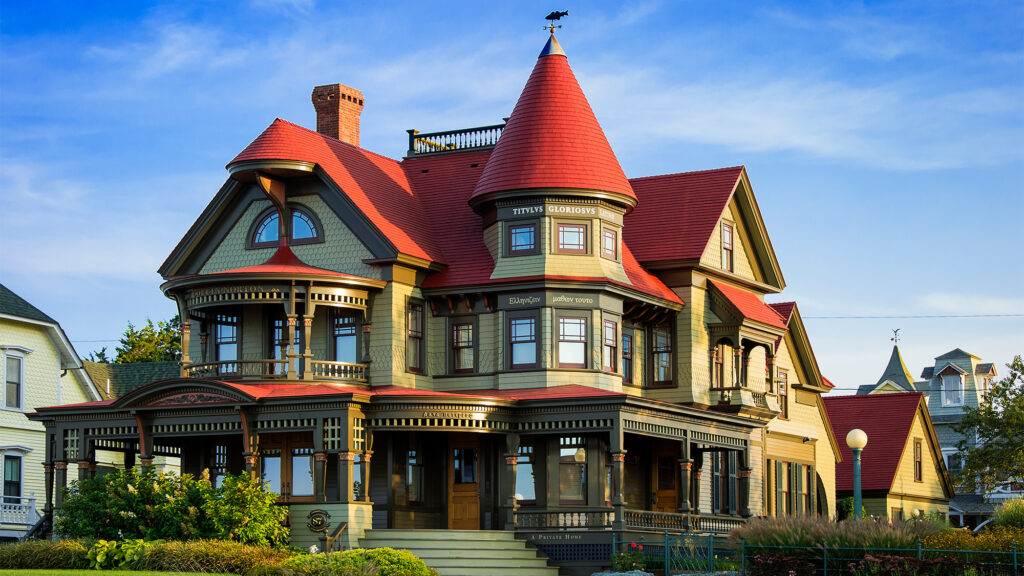
Victorian
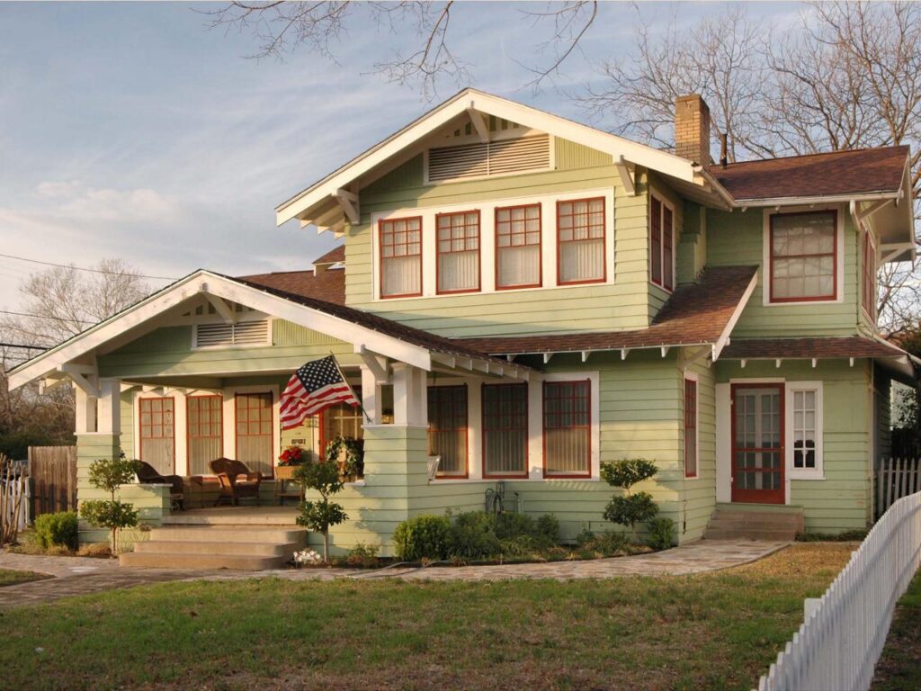
Craftsman
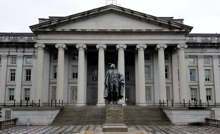
Classical
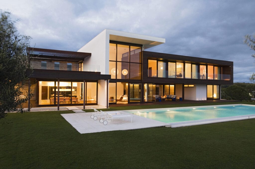
Modern
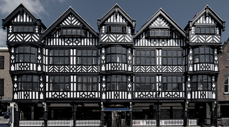
Tudor
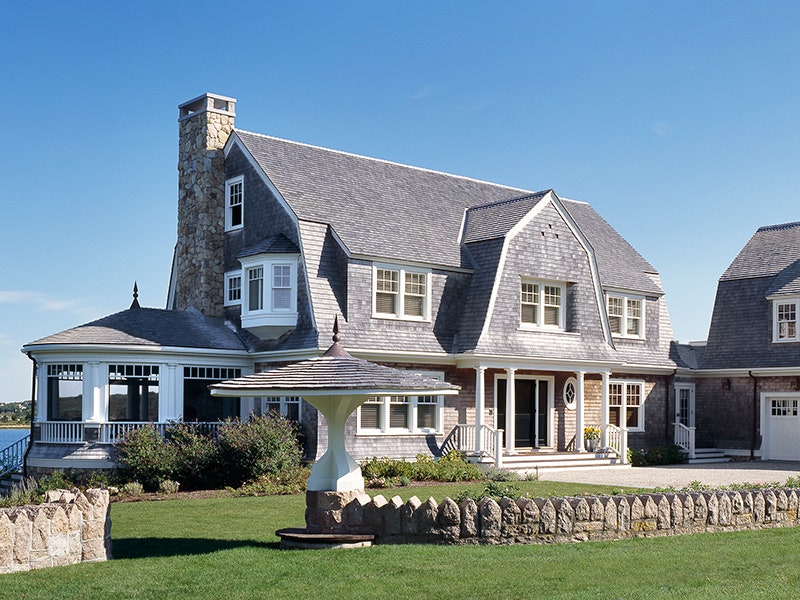
Cape Cod
I do have some class imbalance:
- Cape Cod: 94
- Craftsman: 94
- Tudor: 49
- Victorian: 73
- Classical: 148
- Modern: 75
This could be concerning, especially given the large spread between the number of images available for Classical and Tudor architectural styles. However, the main point of this guide is to show how you can apply SHAP to a fastai model so we won’t worry too much about class imbalance here.
Set up your environment
I’ve been using Paperspace to train deep learning models for my personal use. It’s a clean, intuitive platform, and there’s a free GPU option, although those instances are first-come, first-serve so they’re often unavailable.
Instead, I opted to pay $8 a month for their Developer plan to gain access to the upgraded P4000 GPU at $0.51 per hour. Completely worth it, IMO, for the speed and near-guaranteed access.
BEWARE! Paperspace does not autosave your notebooks. I’ve been burned by this too many times. Don’t forget to hit save!
Ensure you have the following packages imported into your workspace:
import fastbook
from fastbook import *
from fastai.vision.all import *
fastbook.setup_book()

import tensorflow
import shap

import matplotlib.pyplot as pl
from shap.plots import colors
Create a DataLoaders object
fastai has a DataLoaders class that reads in your data, assigns it the correct data type, resizes, and performs data augmentation—all in one!
dblock = DataBlock(
    # define X as images and Y as categorical
    blocks=(ImageBlock(), CategoryBlock()),

    # retrieve images from a given path
    get_items=get_image_files,

    # set the directory name as the image classification
    get_y=parent_label,

    # resize the images to squares of 460 pixels
    item_tfms=Resize(460),

    # see explanation below for batch_tfms
    batch_tfms=[
        *aug_transforms(size=224, min_scale=0.75),
        Normalize
    ]
)
The batch_tfms argument performs the following transformations on each batch:
- Resizes to squares of 224 pixels
- Ensures that cropped images are no less than 0.75 of the original image
- By default, flips horizontally but not vertically (desired behavior for images of buildings)
- By default, applies a random rotation of 10 degrees
- By default, adjusts brightness and contrast by 0.2
- The
Normalizemethod will normalize your pixel values to have a mean of 0 and a standard deviation of 1.
These batch transformations are performed on the GPU after the resizing specified in item_tfms, which takes place on the CPU. This order of operations ensures that our images are standardized first before we hand them off to the GPU to perform the more intensive transformations.
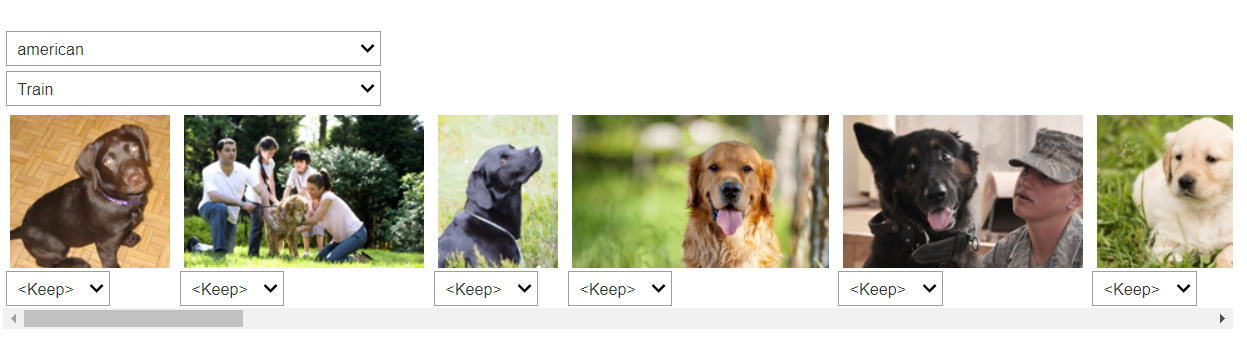
Let’s look at one batch.
dls = dblock.dataloaders('images/', bs=32)
dls.show_batch()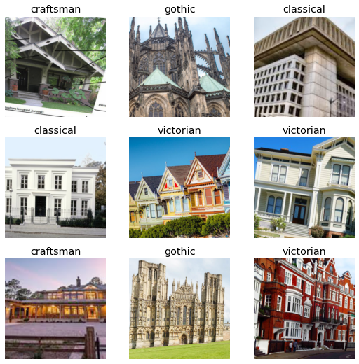
We see that some slight transformations have been performed to augment our dataset but that the integrity of the architecture has been maintained (i.e. straight lines are still straight, buildings are still the correct side up).
Train a neural net
We’ll use a technique described in Chapter 7 of Practical Deep Learning for Coders to train our neural network: progressive resizing.
The first layers of a neural network are only focused on high-level image characteristics, like edges and gradients, and the later layers start to discern finer features, like windows and cornices.
We can save time by training the neural network initially on smaller images so that the model begins to build those early layers on basic features. Then we hone our accuracy by training the model further on larger images that show more of the details.
Let’s first train on images that are 128 pixels square.
def get_dls(bs, size):
    dblock = DataBlock(
        blocks=(ImageBlock, CategoryBlock),
        get_items=get_image_files,
        get_y=parent_label,
        item_tfms=Resize(460),
        batch_tfms=[
            *aug_transforms(size=size, min_scale=0.75),
            Normalize
        ]
    )
    return dblock.dataloaders('images/', bs=bs)

dls = get_dls(128, 128)
learn = Learner(
    dls,
    xresnet50(n_out=dls.c),
    loss_func=LabelSmoothingCrossEntropy(),
    metrics=accuracy
)
learn.fit_one_cycle(8, 3e-3)| epoch | train_loss | valid_loss | accuracy | time |
|---|---|---|---|---|
| 0 | 2.079040 | 1.992693 | 0.168000 | 00:12 |
| 1 | 2.007177 | 3.295360 | 0.160000 | 00:10 |
| 2 | 1.963840 | 2.741498 | 0.184000 | 00:09 |
| 3 | 1.892974 | 3.044773 | 0.192000 | 00:09 |
| 4 | 1.820223 | 2.232864 | 0.344000 | 00:10 |
| 5 | 1.717004 | 2.542991 | 0.336000 | 00:09 |
| 6 | 1.640253 | 2.123204 | 0.344000 | 00:09 |
| 7 | 1.581773 | 1.813185 | 0.424000 | 00:10 |
Now we increase our image size to 224 pixels square.
learn.dls = get_dls(32, 224)
learn.fine_tune(9, 1e-3)| epoch | train_loss | valid_loss | accuracy | time |
|---|---|---|---|---|
| 0 | 1.189884 | 1.130392 | 0.648000 | 00:12 |
| 1 | 1.167626 | 1.170792 | 0.680000 | 00:12 |
| 2 | 1.188928 | 1.349947 | 0.552000 | 00:12 |
| 3 | 1.158677 | 1.123495 | 0.680000 | 00:12 |
| 4 | 1.119656 | 1.112812 | 0.696000 | 00:11 |
| 5 | 1.067710 | 1.094795 | 0.720000 | 00:12 |
| 6 | 1.011549 | 1.011965 | 0.792000 | 00:11 |
| 7 | 0.962006 | 0.975919 | 0.800000 | 00:12 |
| 8 | 0.933495 | 0.963801 | 0.808000 | 00:11 |
Not bad! Roughly 80% accuracy after barely any code and just a few minutes of training time.
Evaluate the model
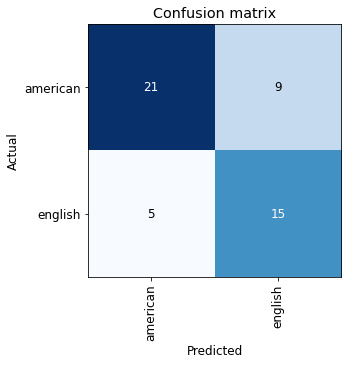
We do have some significant class imbalance so the accuracy shown above isn’t telling us the full story. Let’s look at class-based accuracy to see how the model performs on each architectural style.
preds = learn.get_preds()
pred_class = preds[0].max(1).indices
tgts = preds[1]

for i, name in enumerate(dls.train.vocab):
    idx = torch.nonzero(tgts==i)
    subset = (tgts == pred_class)[idx]
    acc = subset.squeeze().float().mean()
    print(f'{name}: {acc:.1%}')
cape_cod: 82.4%
classical: 88.9%
craftsman: 75.0%
gothic: 94.4%
modern: 92.3%
tudor: 62.5%
victorian: 63.6%We have decent accuracy on across the classes. Let’s create a confusion matrix to see which architectural styles the model mistakes for another.
interp = ClassificationInterpretation.from_learner(learn)
interp.plot_confusion_matrix()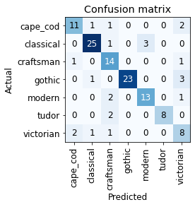
We see that Tudor can sometimes be misclassified as Craftsman. Perhaps this is because both styles rely on exposed beams. Similarly, we could surmise that Gothic is most often confused with Victorian because both contain ornate decorations or that Classical can be mistaken for Modern due to a prevalence of clean lines.
How can we test these hypotheses? This is where SHAP comes into play.
Explain with SHAP
SHAP explains feature importances through Shapley values, a concept borrowed from game theory. If you’re interested in learning more, I suggest checking out the SHAP documentation.
Let’s apply SHAP to the model we trained above. First, we determine a background distribution that defines the conditional expectation function. Then we sample against this background distribution to create expected gradients, allowing us to approximate Shapley values.
# pull a sample of our data (128 images)
batch = dls.one_batch()

# specify how many images to use when creating the background distribution
num_samples = 100
explainer = shap.GradientExplainer(
    learn.model, batch[0][:num_samples]
)

# calculate shapely values
shap_values = explainer.shap_values(
    batch[0][num_samples:]
)
Now we can overlay the Shapley values on the images to see which features the model focuses on to make a classification.
In the images below, positive Shapley values in red indicate those areas of the image that contributed to the final prediction whereas negative Shapley values in blue show areas that detracted from that prediction.
import matplotlib.pyplot as pl
from shap.plots import colors

for idx, x in enumerate(batch[0][num_samples:]):
    x = x.cpu() # move image to CPU
    label = dls.train.vocab[batch[1][num_samples:]][idx]
    sv_idx = list(dls.train.vocab).index(label)

    # plot our explanations
    fig, axes = pl.subplots(figsize=(7, 7))

    # make sure we have a 2D array for grayscale
    if len(x.shape) == 3 and x.shape[2] == 1:
        x = x.reshape(x.shape[:2])
    if x.max() > 1:
        x /= 255.

    # get a grayscale version of the image
    x_curr_gray = (
        0.2989 * x[0,:,:] +
        0.5870 * x[1,:,:] +
        0.1140 * x[2,:,:]
    )
    x_curr_disp = x

    abs_vals = np.stack(
        [np.abs(shap_values[sv_idx][idx].sum(0))], 0
    ).flatten()
    max_val = np.nanpercentile(abs_vals, 99.9)

    label_kwargs = {'fontsize': 12}
    axes.set_title(label, **label_kwargs)

    sv = shap_values[sv_idx][idx].sum(0)
    axes.imshow(
        x_curr_gray,
        cmap=pl.get_cmap('gray'),
        alpha=0.3,
        extent=(-1, sv.shape[1], sv.shape[0], -1)
    )
    im = axes.imshow(
        sv,
        cmap=colors.red_transparent_blue,
        vmin=-max_val,
        vmax=max_val
    )
    axes.axis('off')

    fig.tight_layout()

    cb = fig.colorbar(
        im,
        ax=np.ravel(axes).tolist(),
        label="SHAP value",
        orientation="horizontal"
    )
    cb.outline.set_visible(False)
    pl.show()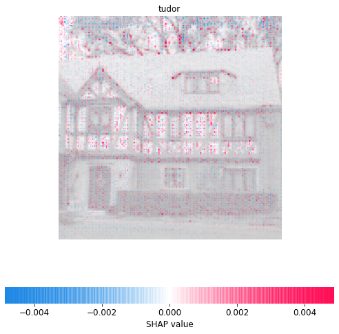
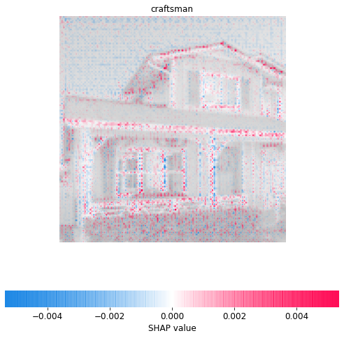
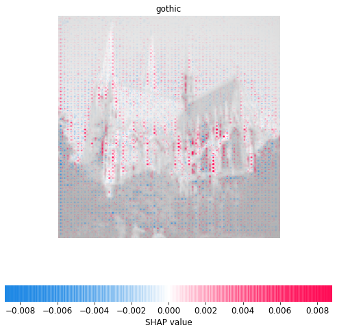
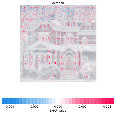
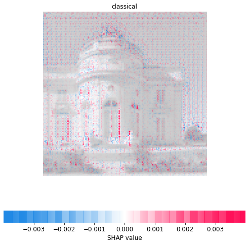
Excellent! This aligns with our intuition. We see that the model relies on the beam latticework to predict Tudor, the roofline to predict Craftsman, and flying buttresses to predict Gothic. It seems to consider window and door trim important to Victorian architecture and narrow windows a key feature of Classical design.
Conclusion
It’s easier than ever to apply deep learning techniques to any project. But with great power comes great responsibility! Understanding how a model arrives at its conclusions is essential to building trust with stakeholders and debugging your model.
Our architecture classifier could also be a visual teaching tool to explain what makes each architectural design distinct and could be incorporated into some kind of flashcard system to help others learn the differences. Sometimes, the explanations can also be the goal itself!
 , where the
  operator implies an action. In other words, if there is a difference between the probability of an outcome
  given
given  and the probability of